Modernizing the 10ft Experience
Redesigning STARZ’s TV Apps to Boost Engagement and Brand Perception
After six years without significant updates, STARZ’s TV applications (Roku, Android TV, WebTV, and tvOS) required a comprehensive redesign to align with the brand’s refreshed identity and meet evolving user expectations.
As Lead Product Designer, I led the redesign of STARZ’s TV applications—an effort to transform a dated, fragmented experience into something worthy of the premium content it delivered. We began by digging into user behavior and feedback, uncovering frustration with clunky navigation and inconsistent presentation. From there, I partnered closely with engineering, marketing, content, and product teams to align on a unified vision—one that balanced performance needs with bold brand expression. Along the way, we built a scalable design system flexible enough to support multiple platforms, yet cohesive enough to feel unmistakably STARZ.

One of the primary challenges was reconciling the diverse priorities of multiple stakeholders:
- Engineering focused on performance and scalability.
- Marketing emphasized visual impact and brand consistency.
- Content Teams wanted enhanced visibility for cast and metadata.
- Business Stakeholders aimed to optimize monetization strategies.
To address these, I facilitated collaborative sessions to establish guiding principles and created interactive prototypes to visualize trade-offs.
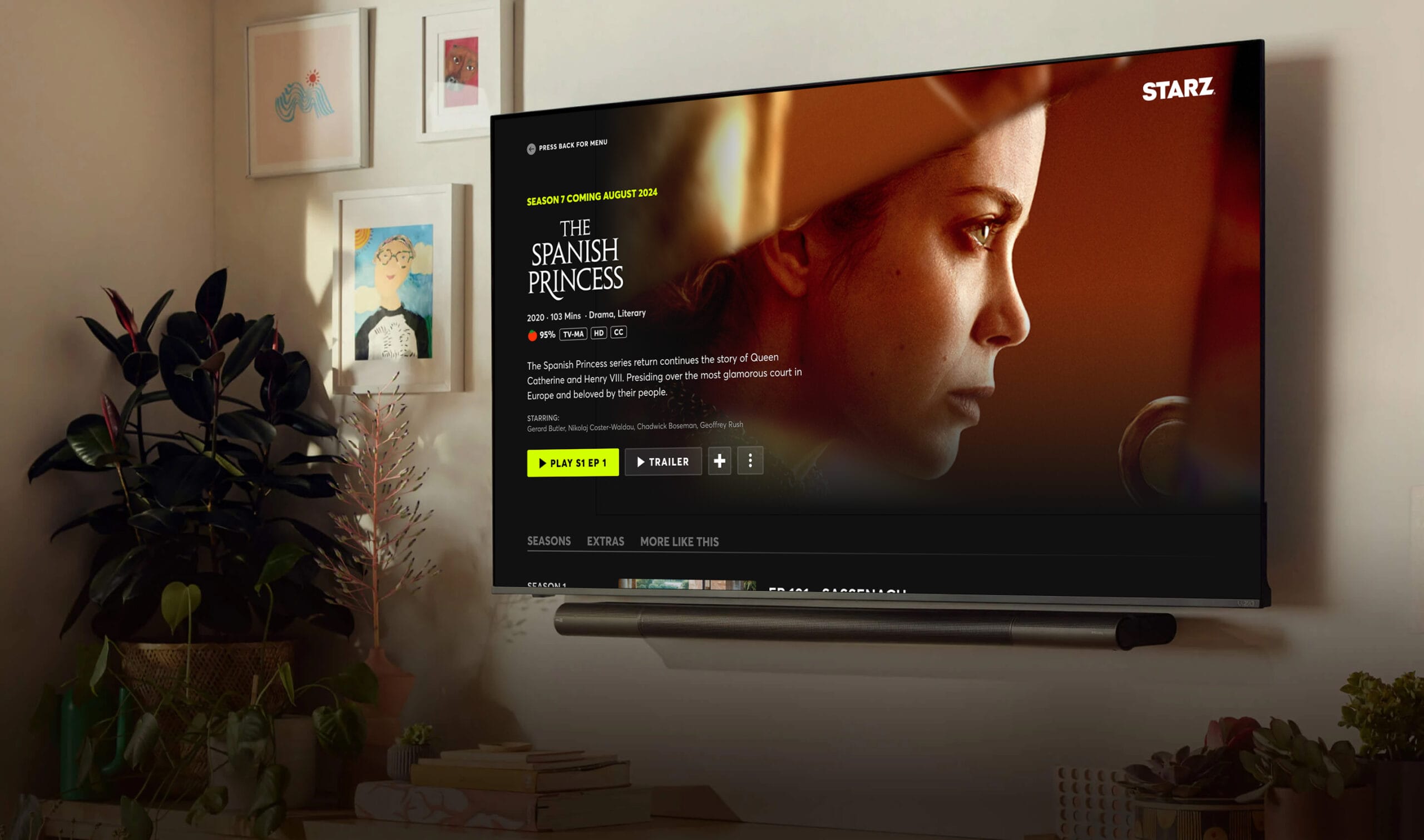
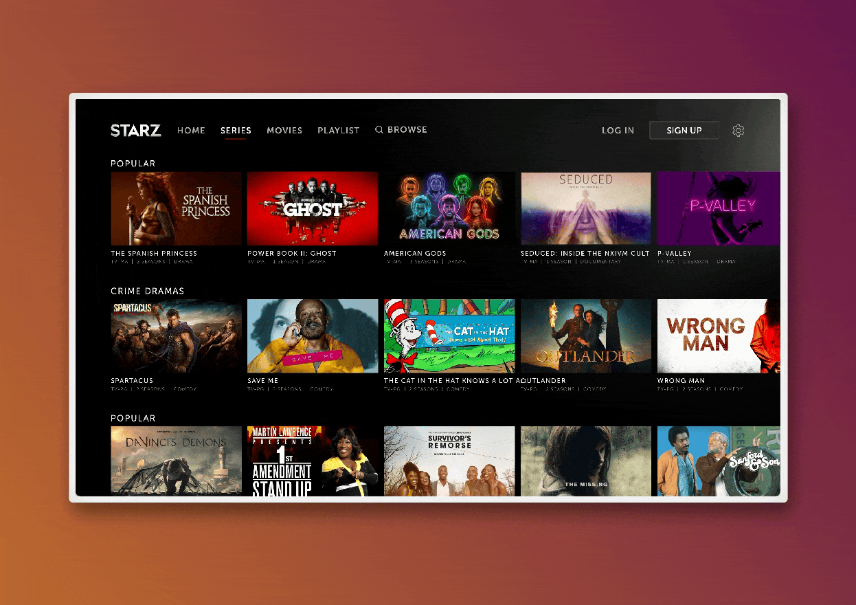
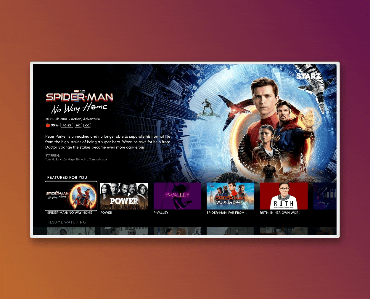
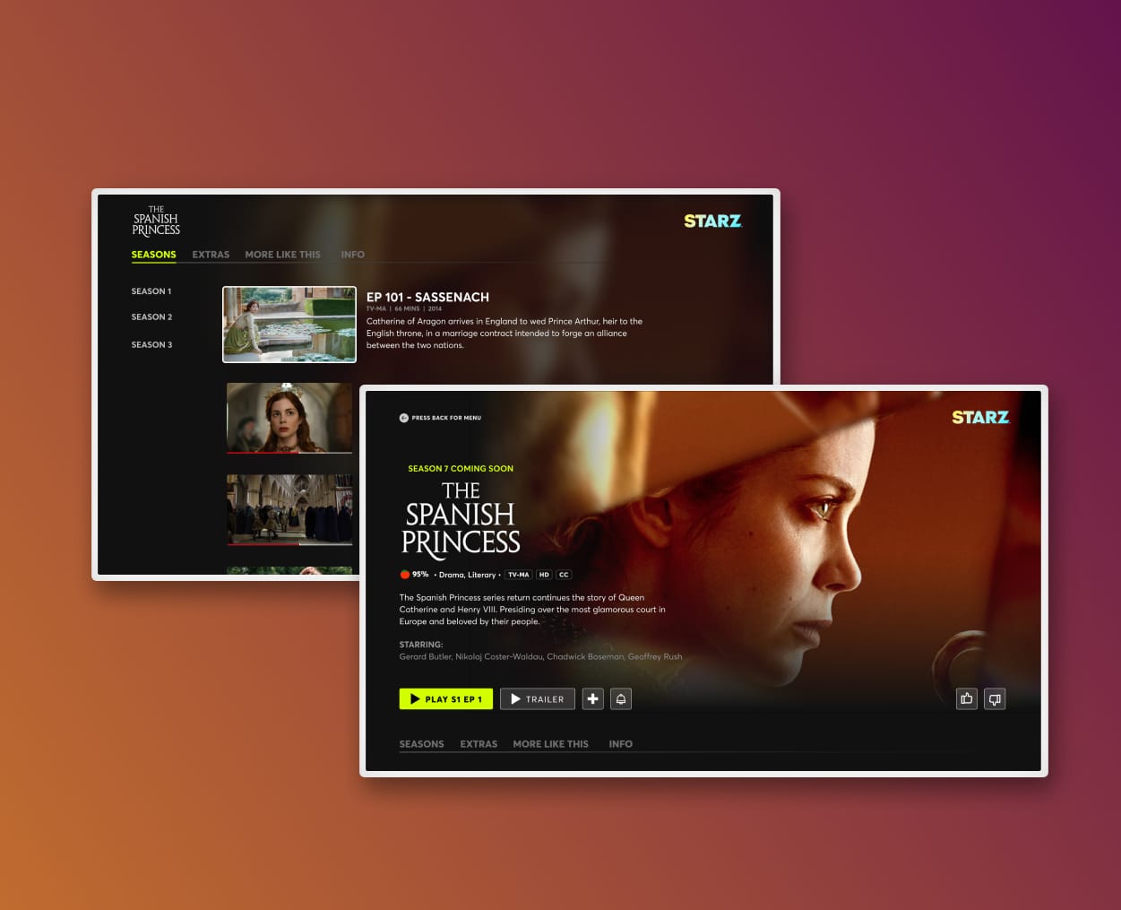
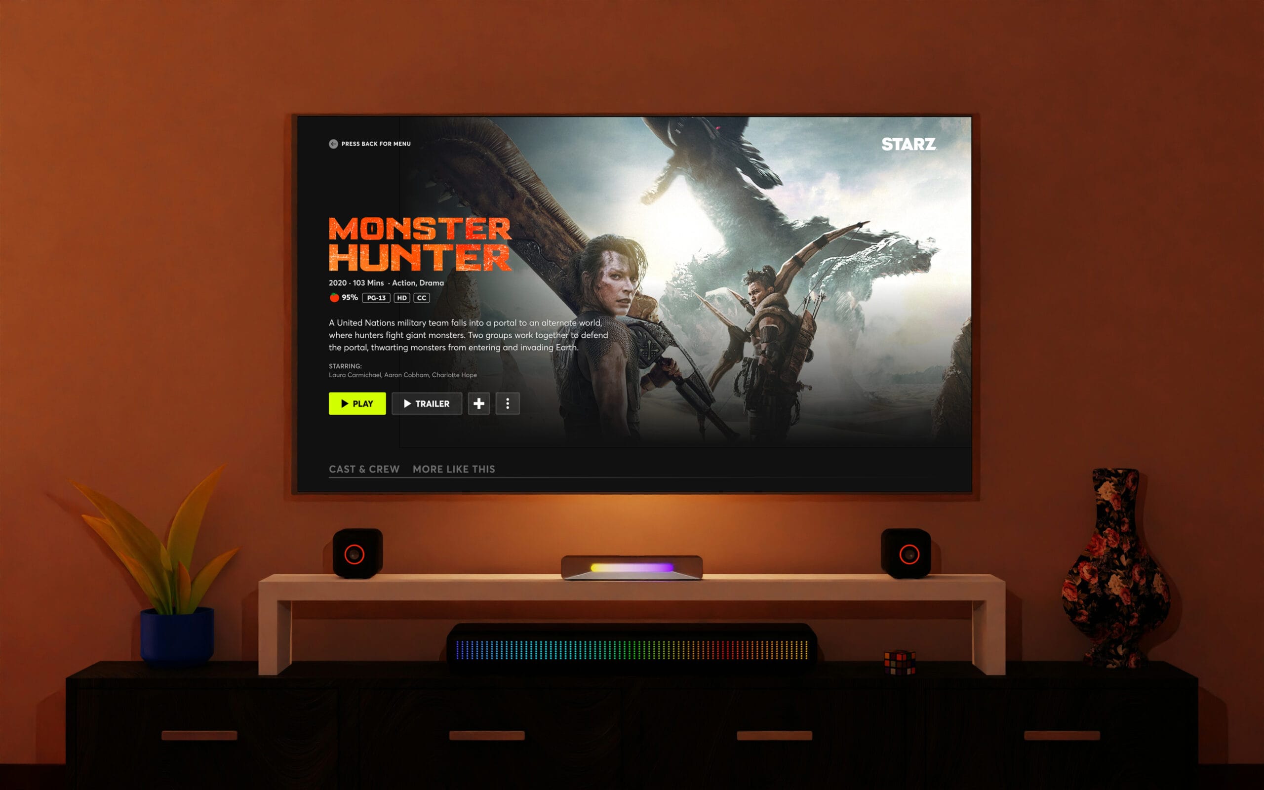
The redesign introduced a more intuitive navigation structure, leveraging bold, cinematic artwork to enhance visual appeal. Key features included:
- A streamlined content hierarchy aligning with leading streaming platforms.
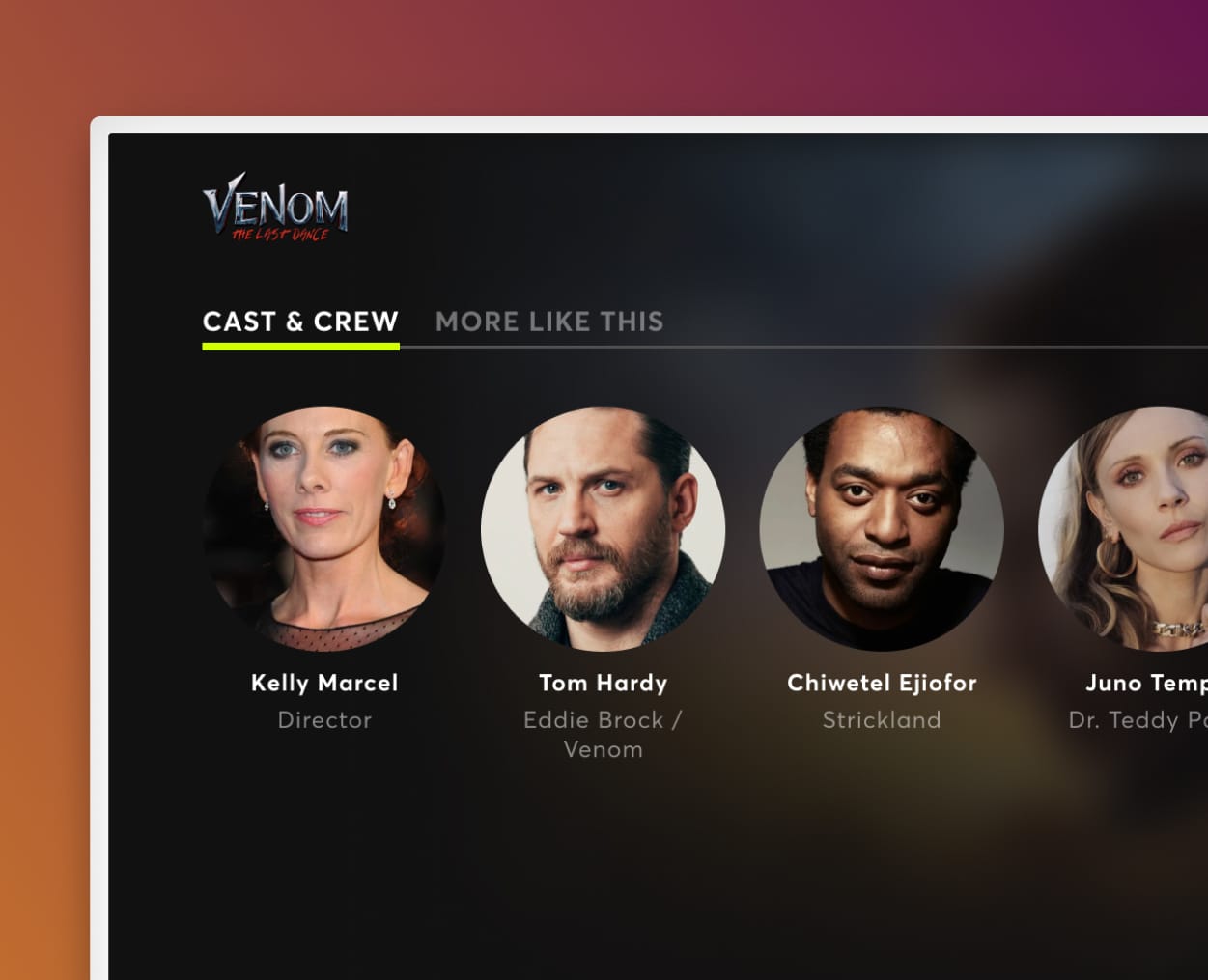
- Enhanced metadata presentation for improved content comprehension.
- Strategic gating of content to encourage free-to-paid user conversion.
After launch, the impact was clear. Watchlist additions jumped by 22%, and engagement with series content rose by 31%, showing that users were finding it easier—and more enjoyable—to explore and commit to shows. Surveys pointed to improved satisfaction with navigation and visual clarity, while conversion rates from free to paid users also saw a meaningful lift. Beyond the numbers, this project proved how thoughtful, user-centered design could directly support business goals and reshape the perception of STARZ as a modern, premium streaming platform.
Modernizing STARZ TV: A Smarter, Seamless Streaming Experience
As Lead Product Designer, I led the redesign of the STARZ TV applications to address growing usability and discovery challenges. Through deep user research and close collaboration with engineering and product, we overhauled the navigation, streamlined content access, and introduced a scalable design system across platforms.